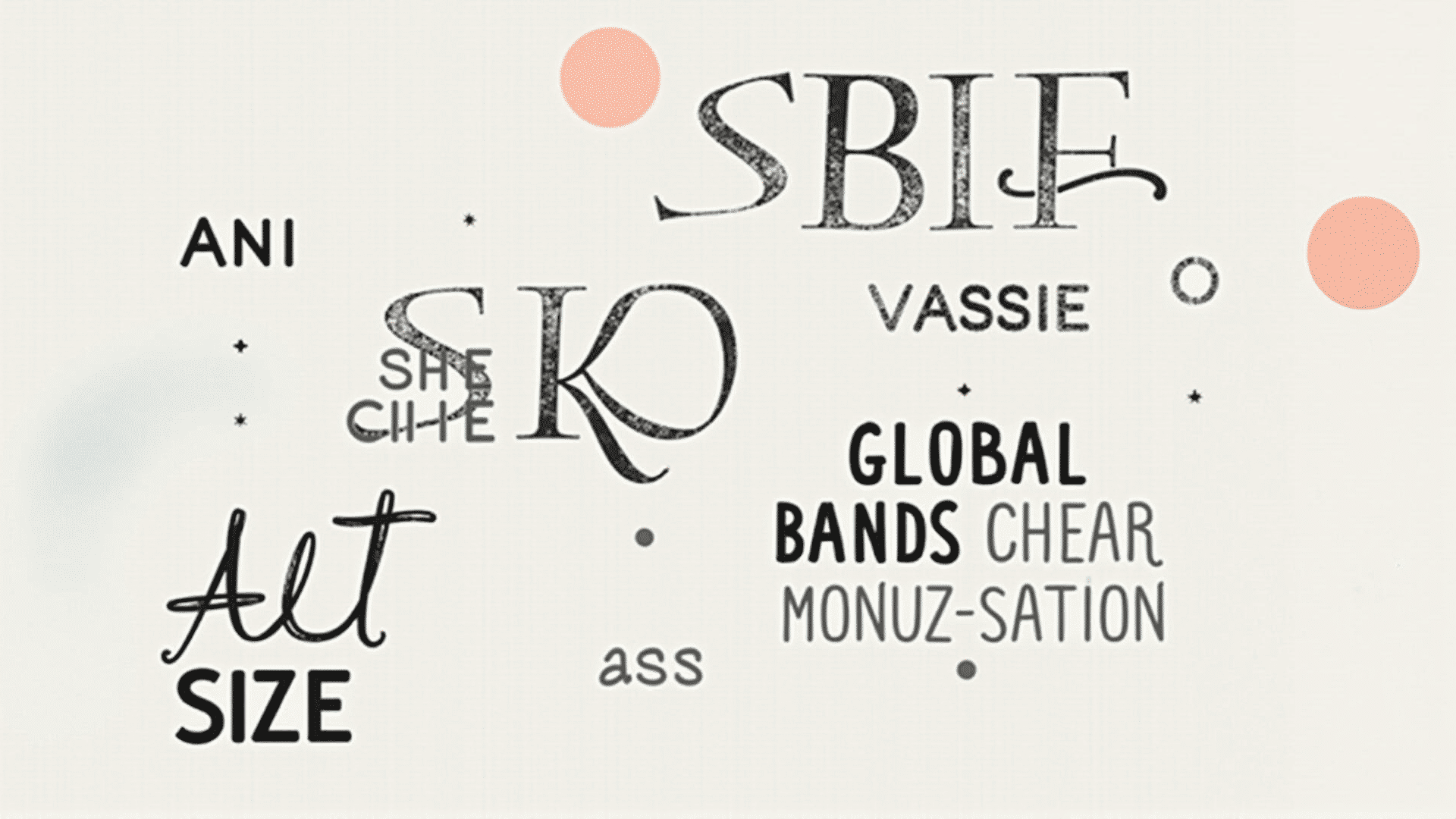
Typography is an essential element in any visual creation, playing a crucial role in the effectiveness of a project by enhancing its readability and aesthetic appeal. A solid understanding and application of typography principles can significantly impact how an audience engages with and perceives the content. Let’s explore these foundational principles and how they can be leveraged to create visually appealing and legible textual layouts.
Font Choice
Selecting the right typeface is paramount, as it sets the tone for the entire piece. Different fonts convey different emotions and characteristics. For instance, serif fonts like Times New Roman exude a traditional and reliable feel, while sans-serif fonts, such as Helvetica, project a modern and clean appearance. Understanding the context and audience helps in the appropriate selection of fonts, ensuring the text aligns with the intended message.
Hierarchy and Structure
Establishing a clear typographic hierarchy guides the reader through the content seamlessly. Hierarchy is often achieved by varying font sizes, weights, and styles to differentiate headings, subheadings, and body text. For example, using a larger, bold type for headings and a smaller size for body text helps readers quickly navigate the material, focusing on the most critical points first before delving into details.
Alignment and Spacing
Proper alignment and spacing significantly affect the overall harmony and readability of text. Alignment refers to the text arrangement on the page – options include left-aligned, right-aligned, centered, or justified text. Each option creates a distinct visual feel and should be chosen based on the nature of the content. Meanwhile, consistent use of spacing – both between lines (leading) and between letters (kerning) – ensures an uncluttered presentation that is easy for the reader’s eyes to follow.
Contrast and Color
Contrast is another powerful tool in typography. It pertains to the differences in weight, size, and color, which help in distinguishing various text sections. High contrast enhances legibility and draws attention to critical elements, whereas low contrast can harmonize and unify the text with other design elements. Color also plays a vital role, not only in readability but in visual appeal. Choosing complementary or analogous colors can create a cohesive and pleasant design, while bold and contrasting colors can be used to highlight important information.
Consistency
Maintaining consistency throughout a project is crucial for creating a cohesive and professional look. Consistent use of fonts, sizes, and colors helps to reinforce the brand identity and ensures the readability and flow of the text. It avoids visual confusion and ensures that users have a seamless experience as they interact with the content.
By thoughtfully applying these typography principles, creators can enhance the aesthetic and functional qualities of their work. Paying careful attention to font choice, hierarchy, alignment, contrast, and consistency not only improves legibility but also fortifies the communication of ideas and emotions through text. This disciplined approach to typography focuses on the reader's experience and makes the visual material more engaging and effective.